There’s a saying in our industry – “Flat frequency response on-axis is necessary, but not sufficient, to make a good sounding loudspeaker.”
OK, maybe you don’t hear this idea tossed around all the time, but it’s true nonetheless. This edition of the Consultant Courier will explore off-axis frequency response, directivity, and the various ways this data is displayed.
Directivity calculates the difference between the on-axis response and the off-axis response of a loudspeaker. It’s measured at different frequencies and off-axis angles in both the horizontal and vertical planes of the loudspeaker. For loudspeakers that are 2-way or more, the crossover frequency range between one driver and the next is often where poorly behaving off-axis response is most noticeable, as the crossover frequency is typically in the middle of the voice range – where the ear is most sensitive.
There are a number of variables involved in measuring and displaying directivity measurements. Frequency, amplitude, off-axis angle and loudspeaker orientation all play a role. Showing a complete picture of a loudspeaker’s directivity on a single graph becomes quite a challenge. We’re going to look at common graphs used to display this data so we can assess and gain the best insight into a loudspeaker’s directivity performance.
Polar Plots
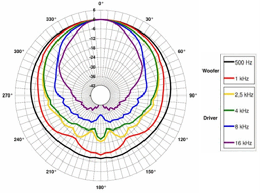
Figure 1 shows one of the most common directivity graphs, a 360o polar plot. Sound level versus off-axis angle is plotted for several discrete frequencies on a polar grid. In this plot, the outermost black line represents the polar response at 500 Hz, and other colors as indicated are increasingly higher frequencies. 0 dB on the second to outermost circle represents the speaker’s normalized SPL – which is usually (but not always) on-axis. With a polar plot like this one, we can fairly quickly evaluate the off-axis measurements for a handful of frequencies to spot any potential poor behavior.
Advantages of polar plots:
- The relationship between sound level and off-axis angle is intuitive
Disadvantages:
- In order to show the polar response of a loudspeaker across the entire audio band, a family of graphs is usually required. If more than a few frequencies are shown on a single polar graph, the plots become too dense to be useful.
- With the typical octave or half-octave spacing between measured frequencies, narrowband response anomalies can be obscured or missed entirely.
Off-Axis Frequency Response Plots
Figure 2 is another common representation of loudspeaker directivity and consists of an overlay of the on-axis frequency response and 10 off-axis curves made in 10o increments off-axis. The image above shows the polar plots for the QSC SR-5152 15” 2-way loudspeaker.
The on-axis response of the loudspeaker is normalized to 0 dB, and the Y-axis represents SPL response above and below the normalized SPL. The normal behavior for any loudspeaker is that the frequency response decreases at higher frequencies (above the frequency where the loudspeaker is essentially omni-directional) versus the off-axis angle. Poorly-behaved loudspeakers will have large (> 4-6 dB) variations in one or more of the off-axis plots. These variations will be particularly audible if they’re in the voice range.
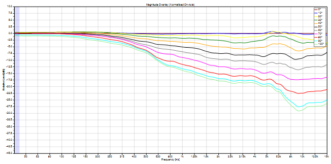
Advantages of Frequency Response vs. Off-Axis Angle Plots:
- These plots use SPL (dB) and frequency (log-scaled) for their axes, which is familiar since it is how frequency response plots are commonly done.
Disadvantages:
- Polar coverage is more difficult to “visualize”, as compared to a polar plot.
Off-Axis Frequency Response Plots – Waterfall Version
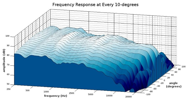
The same data shown in Figure 2 can also be shown on a waterfall plot. In this case, the off-axis curves are shown on the Z-axis, and the plots are shaded based on amplitude. It’s clear that this representation obscures the data above 40o off-axis, which can be problematic if the loudspeaker’s off-axis response is not symmetrical above 0o.
Polar Maps
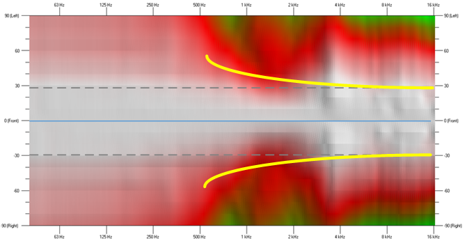
The next type of graph, called a polar map, is essentially a top-down view of the waterfall plot, and clearly shows directivity data on both positive and negative off-axis angles. Figure 4 is the polar map for the QSC SR-5152 15” 2-way loudspeaker, showing the same dataset as Figure 2.
A polar map is designed to show either the horizontal or vertical directivity of a loudspeaker over the front 180o of the loudspeaker’s coverage. The X-axis shows the off-axis angle from -90 o to +90 o – where the straight line marked 0o is the loudspeaker’s on-axis response.
The Y axis is frequency on a log scale. In a polar map, color and color gradations represent relative SPL level. In this figure, the white area represents the highest relative SPL and blue the lowest. Additionally, the area between the gray dashed lines shows the loudspeaker response between +30o and -30o off-axis.
This coverage area is often considered critical for well-behaved loudspeaker directivity since this is where many of the listeners will receive direct sound. In addition, sound radiated from smaller off-axis angles will also drive many of the early reflections listeners hear. Direct sound and early reflections strongly affect listeners’ perception of sound quality.
The yellow lines on the figure show the transition of the loudspeaker’s directivity from omni-directional at low frequencies (the map is mostly white below 300 Hz irrespective of the off-axis angle) to a smooth and well-controlled constant directivity characteristic at and above the 1 kHz crossover frequency. This is the type of response to look for in a well-behaved loudspeaker.
Avoid ragged looking responses in general, and especially responses that narrow around the crossover frequency and then widen above it. This generally indicates that the directivities of the woofer and high-frequency driver are mismatched in the crossover region. No EQ can remedy this, since “correcting” the off-axis response with EQ will negatively affect the on-axis response.
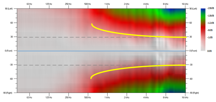
Figure 5 shows the polar map of a different loudspeaker with at least two significant problems (the same markings from Figure 4 are added to Figure 5 for comparison). The directivity narrows substantially from 1 kHz to 2 kHz and then widens significantly in the 3 kHz to 6 kHz region.
Some level of directivity control is regained from 8 kHz to 16 kHz, but the show’s already over by then. The directivity narrows to +/-15o at 1.5 kHz, which suggests that the crossover to the high-frequency driver is too high and forces the woofer to operate far past the frequency where it has reasonably wide directivity.
The second anomaly, just below 4 kHz, looks like a high-frequency horn whose mouth height and width dimensions are too small to maintain good directivity control all the way down to the crossover frequency.
The Takeaway
While not a comprehensive look at all the ways one can graph loudspeaker directivity, we’ve covered the common ones used in most loudspeaker spec sheets. Good information about a loudspeaker’s performance can certainly be gleaned from any type of graph we’ve discussed, but the polar map seems best able to highlight audible anomalies that are not as readily apparent in other types of plots.
In addition, when a loudspeaker does exhibit well-controlled directivity over the entire audio bandwidth, this is clearly shown as well. It’s well worth the effort to become more familiar with reading a polar map because you can learn a great deal about a loudspeaker from this single graph.
Mike Sims
Latest posts by Mike Sims (see all)
- Dante Latency – A Few Details - July 3, 2022
- A Deeper Dive into Loudspeaker Directivity (Consultant Courier) - November 4, 2021
- What About Long-Term Amplifier Power Output? (Consultant Courier) - September 7, 2021