
The AV world is constantly breaking new ground on the user interfaces being offered to end-users, who are now conditioned to expect nothing less. Many larger organizations have teams of graphic designers, marketing consultants, and branding champions working full-time on evaluating and enhancing end-to-end experiences, because customers want the intuitive, minimalist user interfaces that they have access to in their pockets every day. Creating simplicity isn’t always an easy task when you are trying to enable the control of an entire system on a 7-inch touch panel, but the expectation is still there and must be met by AV as much as the rest of the software industry.
While there isn’t one optimal solution, there are some best practices that you can follow even among the diverse methods of designing user interfaces. Let’s go through some of them.
Ask for Branding Guidelines
Most customers will have some sort of branding guidelines that you can reference. They will include colors, fonts, and logo rules to follow. Taking this initial step to retrieve guidelines will save you time and effort when you begin to design your user interface. If a customer does not have branding guidelines, go on their website to see what colors, fonts, icons, and logos they are using.
Recommended Tools: Image Color Picker, What the Font
Create a Flow
When we design systems, we think about how each piece of equipment will connect to the next. The same goes with user interface design. The first step is mocking up a basic flow. Simply laying buttons out on a page without thinking through the flow will make for a confusing interface. Doing this pre-work will avoid that. Write out each of the functions that the end-user will need to be able to accomplish and then plan your methodology. If you want to have a single main page that allows the user to go into subpages, that could be one method (Figure 1). Perhaps you’d rather the user access various pages by navigating in a menu (Figure 2). No matter which method you choose, deciding ahead of time will ensure that you create a user interface that is simple and easy to use.
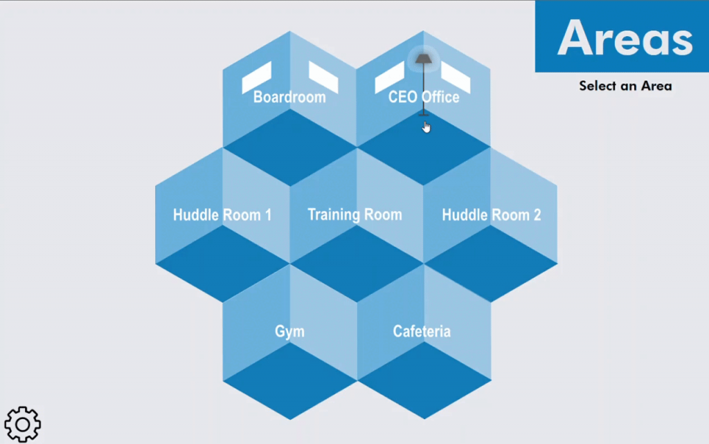
Figure 1 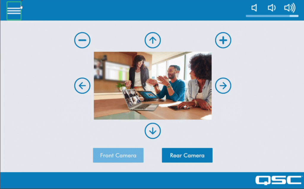
Figure 2

Recommended Tools: Adobe XD, Figma, a flow chart creator of some type
Automate Your UCI
It can be tempting to overcomplicate your UCI, especially within larger systems. Often the best way to maintain simplicity is to give controls based on how users are leveraging the space. Automatically showing and hiding certain pages based user requirements can make for a “smart” user experience. If the user is making a call, for instance, create a page that contains all the controls they need just for that call, namely camera controls, call volume, and mute buttons. Quick access to specific controls based on logic triggers vastly improves the user experience and keeps your UCI clean and efficient.
Use CSS
Cascading Style Sheets (CSS) allow you to create classes for each of your control types, text objects, banners, icons, etc. Taking the time to create a style sheet for your customer’s brand will allow you to make scalable, and templated UCIs faster than ever. QSC has a great example of CSS in the Microsoft Teams Room Sample Design that can be found in Asset Manager. The UCIs in the sample design are using CSS classes for buttons, text objects, icons, and more. I recommend opening the stylesheet by installing it in Asset Manager. This can be a great jumping off point for your own designs!
Click here for more information on how to use CSS within Q-SYS.
Recommended Tools: Q-SYS Help Guide (UCI Styles), Visual Studio Code
Learn a Design Framework
Design frameworks provide a jumpstart toward improving user interfaces. Google created an excellent design system, Material Design, that goes through every guideline to follow, from button style, font size, scaling, etc. No matter which framework you choose, design frameworks are excellent resources to reference and help get you up to speed on modern interface design. I highly recommend finding a framework that works for you.
Recommended Tools: Material.IO, Material Theme Builder
Have Fun!
Designing UCIs in Q-SYS can be a lot of fun. Watch our two incredibly informative (and entertaining) training videos on user experience best practices to learn more (Part One and Part Two)! Then go out there, make something cool and share it with us on QSC Communities for Developers so we can see the awesome things you are working on!
Emily Eicher
Derniers articles parEmily Eicher (voir tous)
- Farewell Asset Manager, Hello Q-SYS Library - November 19, 2025
- Experience What’s Possible with the Q-SYS Partner Ecosystem at ISE - January 20, 2023
- Overview of LG Commercial Display Q-SYS Plugin - September 22, 2022
Interesting
Invaluable info and reference. Thank you!
Awesome article with great resources. I’m definitely going to be recommending this article to the whole team!
Very cool read! Thank you for the in-depth approach. This will be going in my reference materials right away!
Do you have any examples/templates of CSS Sheets so I can wrap my head around how to edit these per customer?
Hi Jonathan. We have some awesome trainings that you can attend that can be super helpful to get started. https://www.qsys.com/resources/webinars/
We also have some Sample CSS files that you can install in Q-SYS Designer Asset Manager.